arrow_back_ios
Back to work
University of Michigan Library

Dark Mode: Scaling the Design System

Team
UX Designer (me!)
Accessibility Specialist
Product Owner
Front-end Developer
Status
🔧In development
Overview
User feedback over the past few years consistently pointed to the bright white interface causing eye strain, highlighting the need for a more accessible, low-light alternative in line with modern design standards. I designed and delivered a dark mode expansion of our design system, validating it through 7 rounds of usability testing. It's now ready for development, with rollout expected in late summer/early fall.
Why did we do this project?

A timely opportunity to fix a long-standing gap

When I joined the Library UX team, the design system had been built a few years years before, but had never been fully applied to Library Search, one of our most-used and most complex tools. With developer time already scheduled this summer to finally bring Library Search up to date with the rest of the library websites, we saw an opportunity: rather than just apply the existing light mode, why not use this moment to expand the design system itself and include dark mode?

The timing mattered. For years, users told us the same thing: the interface was too bright. Colleagues with light-sensitive eye conditions found it physically uncomfortable to use. Students working late into the night wanted something easier on the eyes.

And according to Google Analytics, the data backed up these anecdotes: roughly 25% of our users already had their browser set to a dark mode color scheme preference, telling us the demand was already there. We just weren’t providing them that option.

Insights from Desk Research

Identifying rules before touching a single screen

Rather than simply inverting our existing palette, I conducted desk research. I ran a comparative analysis of style guides with dark mode implementations across products I admired, and distilled it into a set of guiding principles, for example:

  1. Avoid pure black or white
  2. Favor muted neutrals with fewer pops of color over a saturated, colorful palette
  3. Establish a hierarchy of colors for depth and layers
  4. Include an easy-to-find toggle


These principles became our north star. They also immediately exposed a gap: our existing color palette didn't have enough of a shade range on the darker end to support the hierarchy we needed.

Design Process

Collaborative whiteboarding helped us fill in color gaps and define color rules

I met with the UI designer and front-end developer who work on the design system to go through the palette collaboratively. We decided on intermediary shades to be added to the primary color palette (see below) and mapped which would serve as backgrounds, text, buttons, and accents.
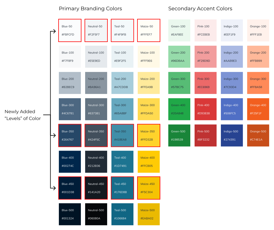
Once the palette felt complete, I applied it to our Library Search screens first. These are our most information-dense, complex screens in the whole system. If dark mode could hold up here, we knew it would scale cleanly everywhere else.

Design Solutions

Leaning into University of Michigan branding for a new dark mode experience

The dark mode kept our existing component structure intact, with only the color values changed, echoing the University of Michigan's color identity.

Here's an overview of the main color decisions:
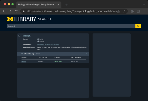
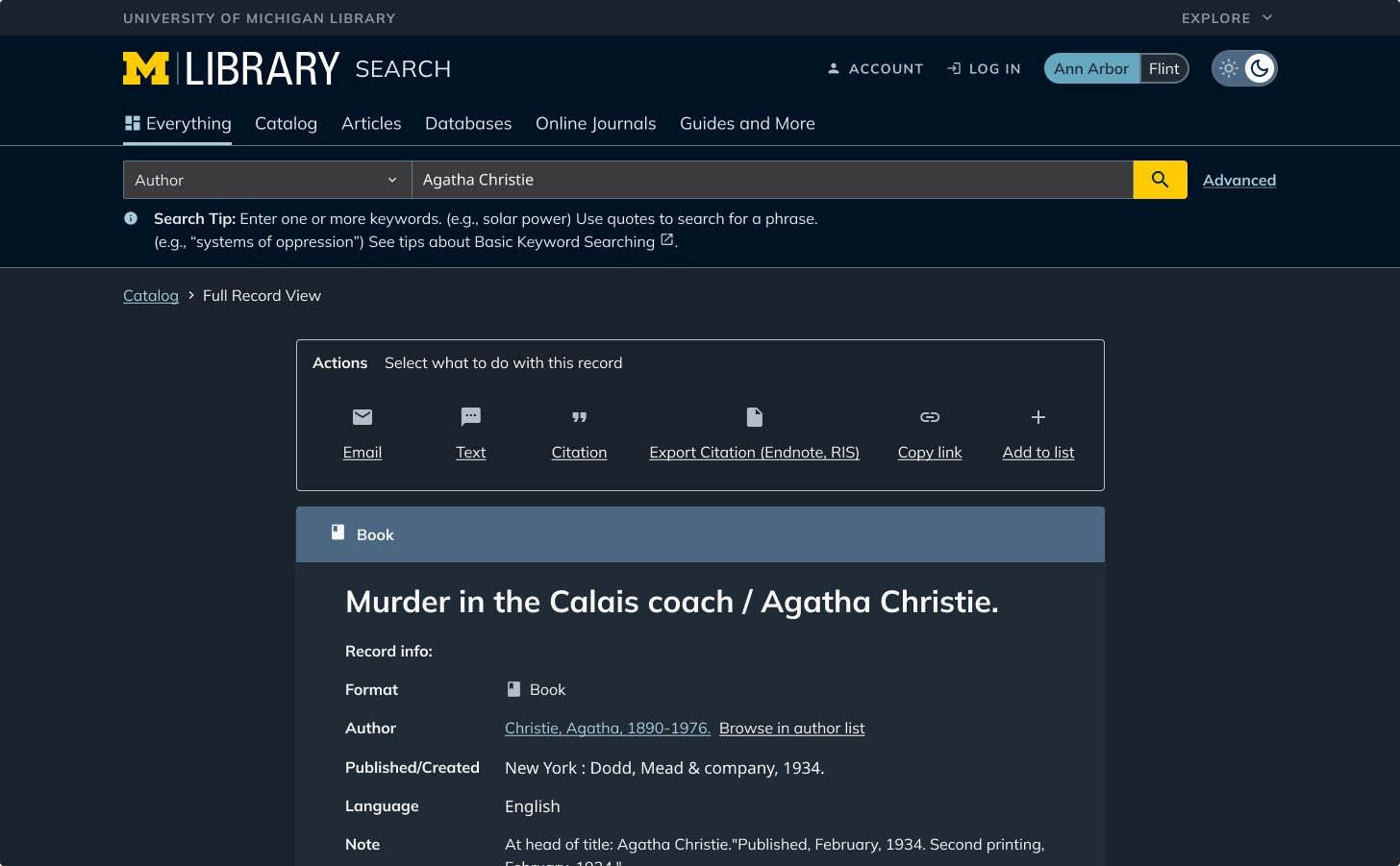
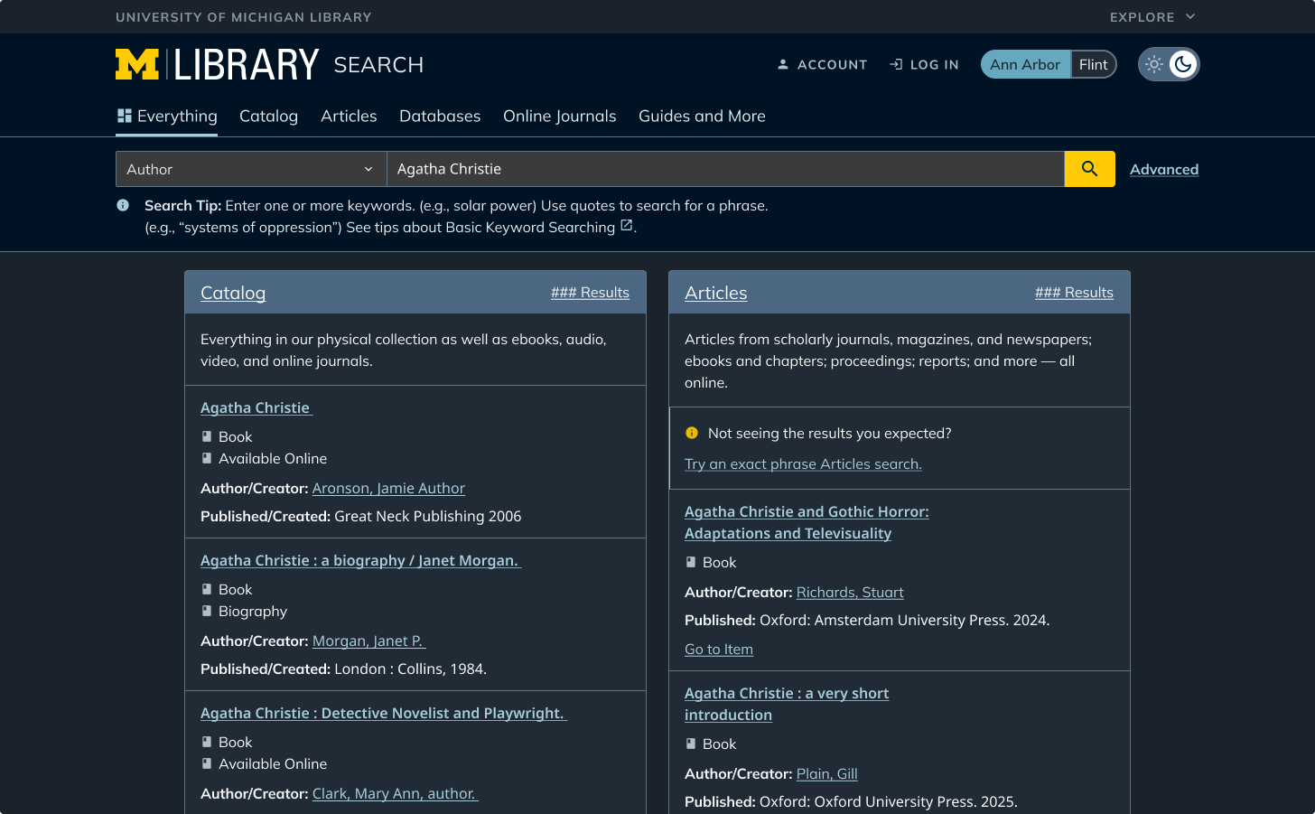
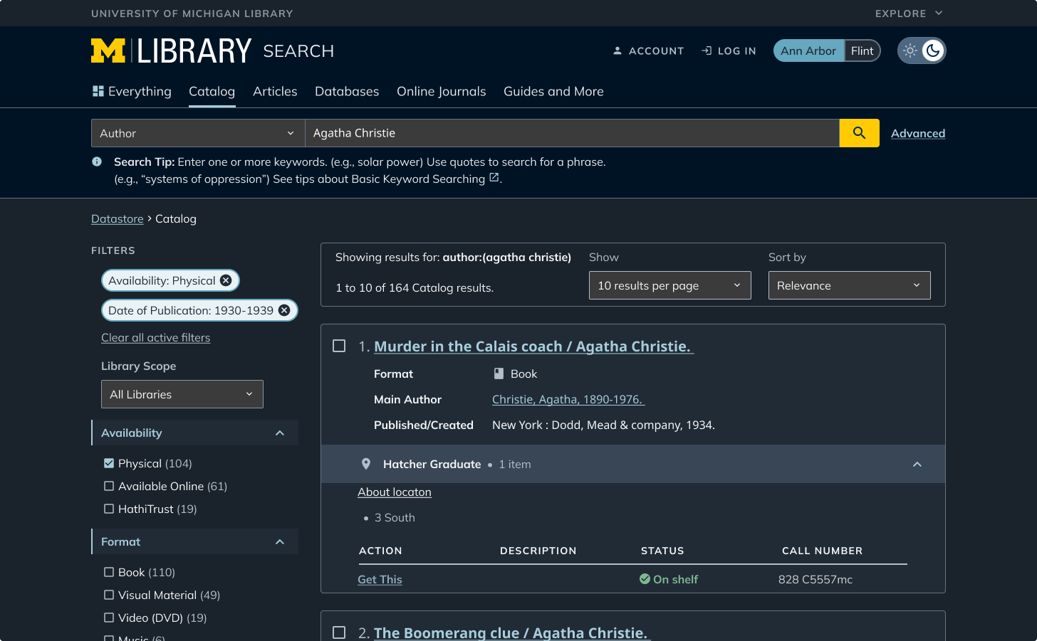
The main background is the second-darkest ‘neutral’ shade, which has a slight blue hue.
The search header uses our darkest 'blue' shade, creating separation from the page body. Accents within this section (the logo, search bar, and search button) echo the branding with maize and brighter blue tones.

Since searching is the primary function of this site, I designed these elements to draw the eye first.
Most information in Library Search lives on cards, organizing dense content into scannable chunks. Cards use the next-lightest neutral shade above the background, with any sub-sections inside a card stepping up to a progressively lighter neutral. I did this to build a clear visual hierarchy.
Primary text uses our second-lightest blue shade, close to white, for comfortable reading contrast. Secondary text and icons use a light grey with less visual weight than primary text. Links and other colorful accents use lighter versions of the same colors from light mode.
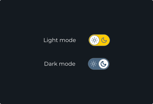
Dark mode is applied automatically based on system or browser preference. Users can also manually switch between light and dark mode using the toggle in the header.
Usability Testing

Stress-testing our assumptions with the densest screens

Before development, I ran 7 usability tests with end users using my interactive Figma prototype. The overall feel of the dark mode was very positively received, and the toggle was a hit. But testing also surfaced some points of friction that needed to be cleaned up:
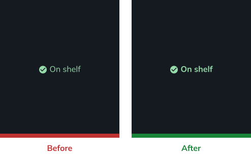
Text weight: Some text, like availability status, felt visually lighter against the dark background than intended, so we bumped it to a heavier weight.
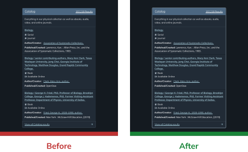
Card contrast: Cards blended too closely into the background. Instead of lightening the cards (which would've hurt text contrast), we added a border to organize the information Into digestible chunks that are easier to scan.
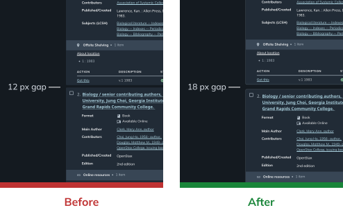
Spacing: Thanks to irradiation illusion, participants noted that search results felt more cramped in dark mode even at identical spacing, so we increased the gaps between cards.
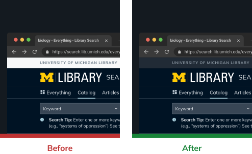
The universal header: This one took convincing. Developers were initially hesitant to touch it since it lived in a separate backend system. But when testers reacted strongly negatively to a stark light header sitting on an otherwise dark page, that data made the case, and the team agreed it was worth the extra development effort.
Where We Landed

Accessible, cohesive dark mode guidelines that are ready to scale

I applied these guidelines across all ~50 pages of Library Search in Figma, documenting implementation patterns for handoff, and delivered the final files to our development team.
Conclusion & Reflections

Lessons from scaling a design system

As of July 2026, the finalized designs have been handed off to our development team, with implementation expected in summer/fall 2026. Dark mode is also currently available on our Design Systems as a preview of what's to come. Some of the feedback we've gotten on that: "Everywhere please!"

Beyond the deliverable itself, this project was an amazing learning experience for me, especially in terms of working with developers.

Once development wraps later this year, I'm looking forward to seeing how real users respond, and using this project as a template for scaling other parts of our design system going forward.