arrow_back_ios
Back to work
University of Michigan Library

An 8-week solo UX design research fellowship that increased new user satisfaction by 5%

Team
Design Researcher (me!)
Product Owner
UI/UX Designer
Front-end Developer
Status
⭐Shipped!
Timeline
8 weeks
Overview
New undergraduate students often found the Library Search tool intimidating, leading to low adoption and reliance on less effective research methods. I conducted user research to understand undergraduate search behaviors, then redesigned the search results landing pages to improve navigation and make the tool easier to approach.
Why did we do this project?

Steep learning curve for new students

Since the redesigned Library Search launched in 2020, the "Everything" results landing page has seen little to no updates, even though years of user research show undergraduate students struggle to onboard to it, a significant barrier to student success.

"I wish it was more beginner-friendly and could better guide new users as to what to do. Once I was taught the tips and tricks, it was easy to use, and I wish I had known about it sooner."
— Undergraduate Student, 2022 Library Search Benchmarking Survey
What I aimed to find out was:
  • What are the specific points in the search flow that cause the most confusion?
  • Are there any UI design solutions that we could implement as "quick wins" to address these pain points?
Insights from User Research

Novice users lack a working library search mental model

To understand novice users' pain points, I conducted 11 interviews with library staff who directly work with incoming students teaching them how to do research. I also conducted 2 usability tests of the website with sophomores who had limited experience with Library Search.

Here are the pain points I discovered:
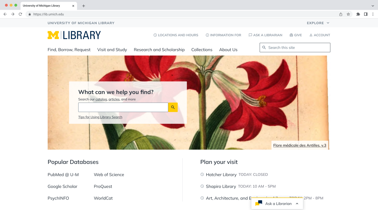
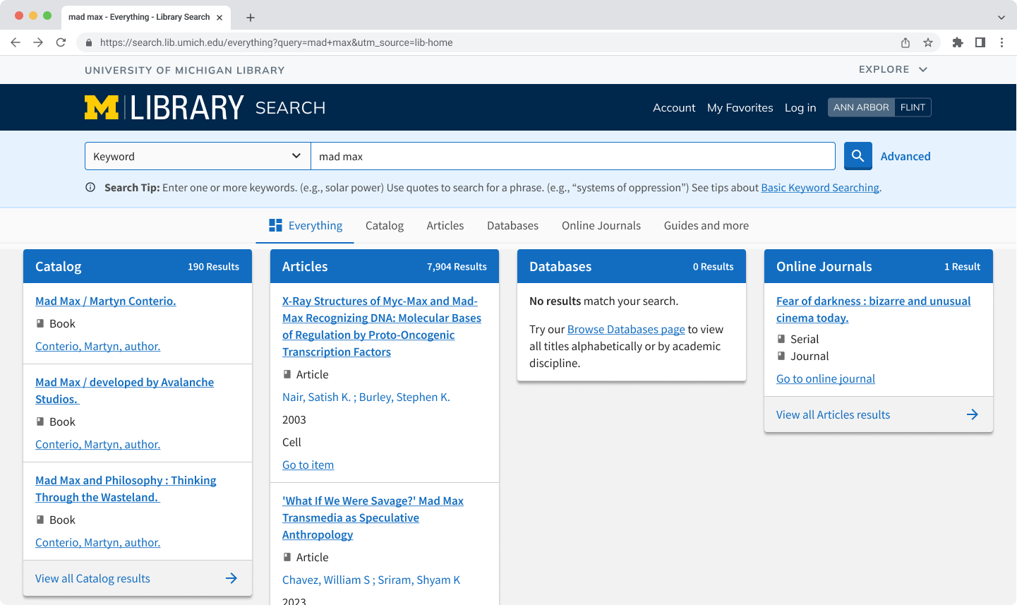
Students nowadays are internet natives, so they have a lot of web-searching experience. So they understand how to enter a search from the homepage...
... but then they land on an unfamiliar results page.

They don't understand library-specific concepts, such as catalogs, so they don’t know which category to click on without anyone telling them.

Many click on Catalog because “that shows everything the library offers.” (Not true!)

Or they click on Articles because that’s the format their assignment requires, and get confused when eBooks are also present.
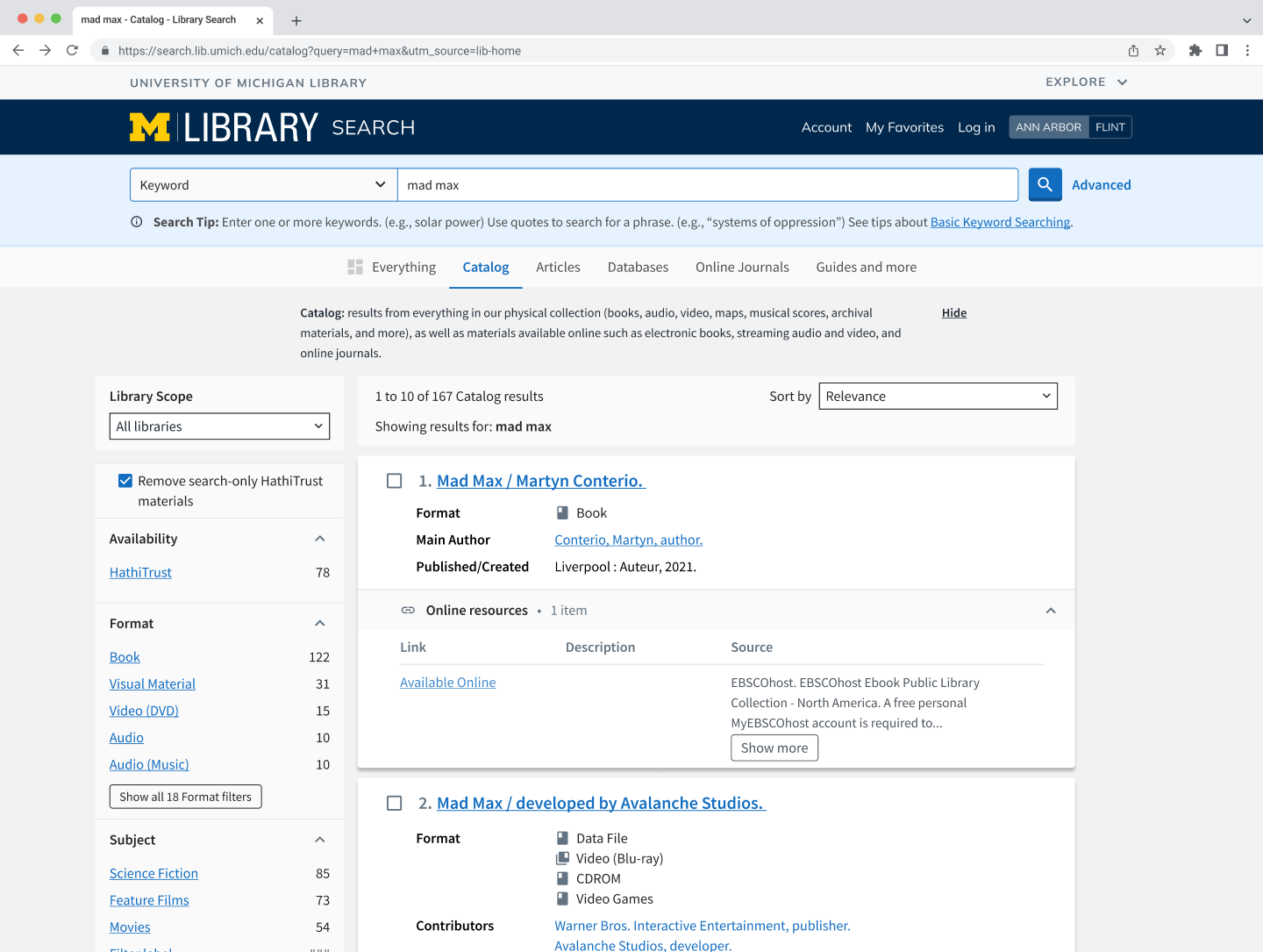
When scrolling through the sub-categories of results, students are relying on titles to evaluate their relevance, which is not a lot of information. They end up having to click in and out many records just to find a good one.

This especially leads to frustration when they finally find something good, and it’s a physical book. Students prefer instant, online access!
Designing a Solution

Research findings and stakeholder priorities shaped my design recommendations

I translated my user research findings into a set of evidence-based design recommendations. I provided Figma mockups and the research results as the basis of my designs.

At the end of my 8-week project, I met with key stakeholders to present my research findings and discuss my design recommendations. During these discussions, the PM's knowledge of the product helped determine which of the following iterations would be worth moving forward with.

Improved Visibility of Help Documents
Why this DIDN'T work:
While the intent was to make help documentation more discoverable, the PM noted that this has been explored multiple times in the past. Analytics consistently show that increased visibility of help docs does not translate to increased clicks or engagement from students. By the time students hit a wall in their research process, they don't have the patience to read written instructions. Instead, we want improvements to help guide stuck users in context.
Online Access Labels
Why this works:
The physical vs. digital distinction is invisible under current labeling, yet it directly affects how quickly students can access a resource. Both usability testing participants responded positively to a competitor's  "Online" label while skimming quickly, which is how students browse.

🎨Design detail:
We opted against using green badges, as they drew too much attention and were mistaken for clickable buttons.
Integrate filters into Everything results
Why this DIDN'T work:
The PM explained that the different search categories within Everything run on separate backend systems that are not currently compatible with one another. Implementing unified filters across all of them simultaneously is not technically feasible within the current system infrastructure.
Datastore descriptions
Why this works:
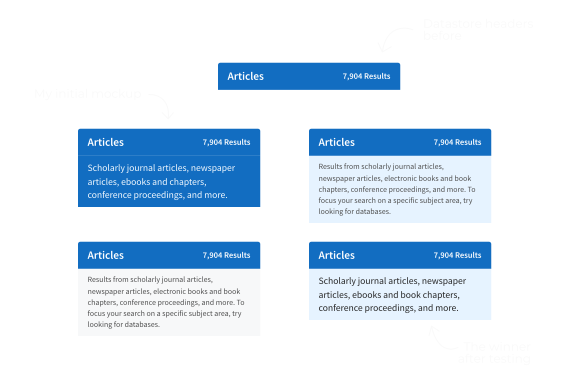
Students consistently struggled to distinguish between Catalog and Articles, often landing in the wrong place before realizing it. Surfacing category descriptions directly in the "Everything" view addresses this at the exact moment confusion occurs, with minimal implementation effort.

🎨Design detail:
We opted for a concise list of formats for each datastore, on a light background for high-contrast readability.
Suggested keywords or related searches
⌛️On hold for future development:
This recommendation was not rejected, but set aside for a larger initiative. The team has been exploring a "smart search" project that would reimagine how students discover and refine their searches, and suggested keyword and related search functionality would be a natural fit for that scope.
Summaries & Subjects
Why this works:
Students are currently clicking into individual records, or even Googling titles, just to read a basic description. Adding abstracts and summaries to the results page removes an unnecessary step and helps students make faster, more confident decisions about which resources are worth pursuing.

🎨 Design detail:
We decided on a 230 character limit for summaries and 3 subject maximum + see more button for subjects to preserve vertical space.
Immediate Outcomes of this project

We decided to focus on subtle explanatory content in order to bridge the mental model gap

I handed off my mockups to the design and development teams, who iterated and tested several options in order to iron out the granular details.

These suggested design solutions went live on the website at the start of the next academic term.

Users can now see what types of materials are included in each "bucket" of content.,

Users can now evaluate results by more than just their titles within the search results.

It is now immediately clear whether a book can be accessed online.

Conclusion

Impact & Metrics

Our benchmarking survey showed a 5% lift in user satisfaction post-UI updates. While several factors likely contributed to this, librarians have shared that the new designs reduce the need for them to provide basic navigation support, freeing them up to focus on deeper research instruction with students.